hist(x, ...)14 Base R plots
1 Graphical presentations in Statistics
Graphs are helpful for presenting a summary of data and results of a statistical analysis
-
John W. Tukey, the father of exploratory data analysis once said
The greatest value of a picture is when it forces us to notice what we never expected to see.
2 Base R plot functions
Graphical presentations of data
- There are several graphs available to use for describing data, and the selection of the most appropriate graph depends on the data type and the research objectives
-
Quantitative data
- Histogram
- Boxplot
- Scatter plot
-
Qualitative data
- Bar chart
Pie chart
- Bivariate analysis involves two variables, depending on the combinations of the variables, i.e., qualitative or quantitative, there are different ways of presenting data graphically
- Quantitative-qualitative combination
- Histogram and boxplot can be used for different levels of a qualitative variable
- Quantitative-quantitative and qualitative-qualitative combinations
- Bar chart and scatter plot can be used
3 Histogram
The function
hist()is used to obtain a histogram of a quantitative variable-
Syntax of
hist()-
xis a quantitative vector
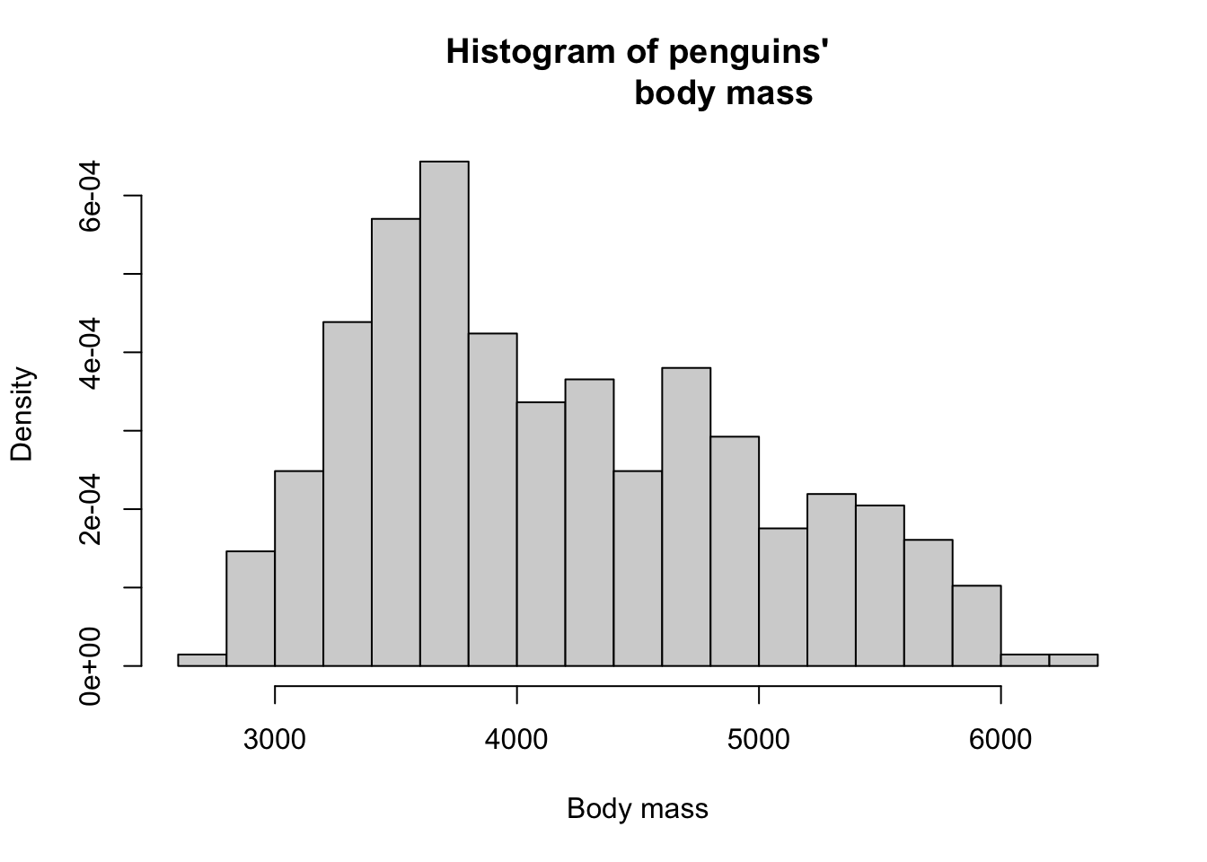
hist(x = penguins$body_mass_g)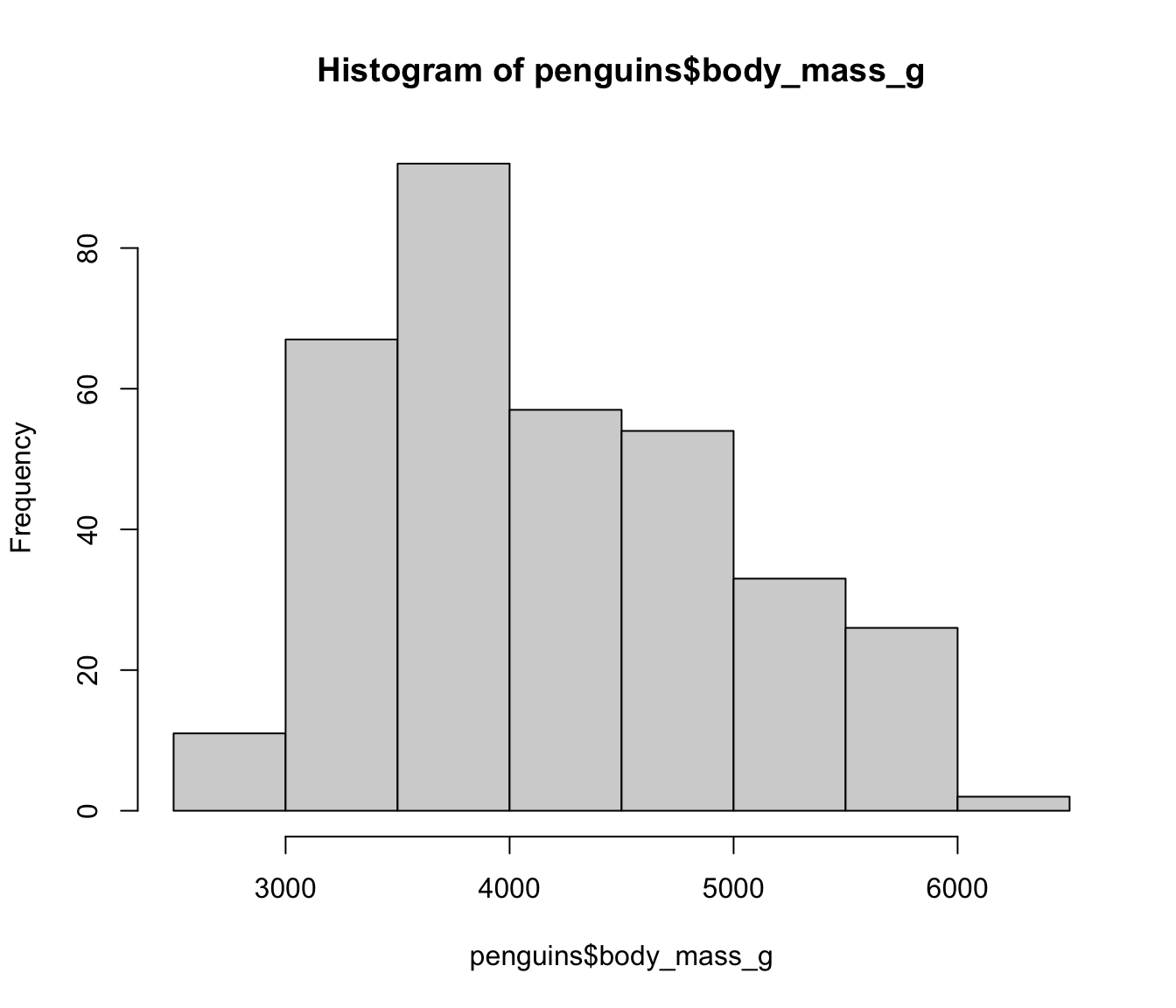
-
- Some useful arguments of
hist():-
xlab,main,probability, etc.
-
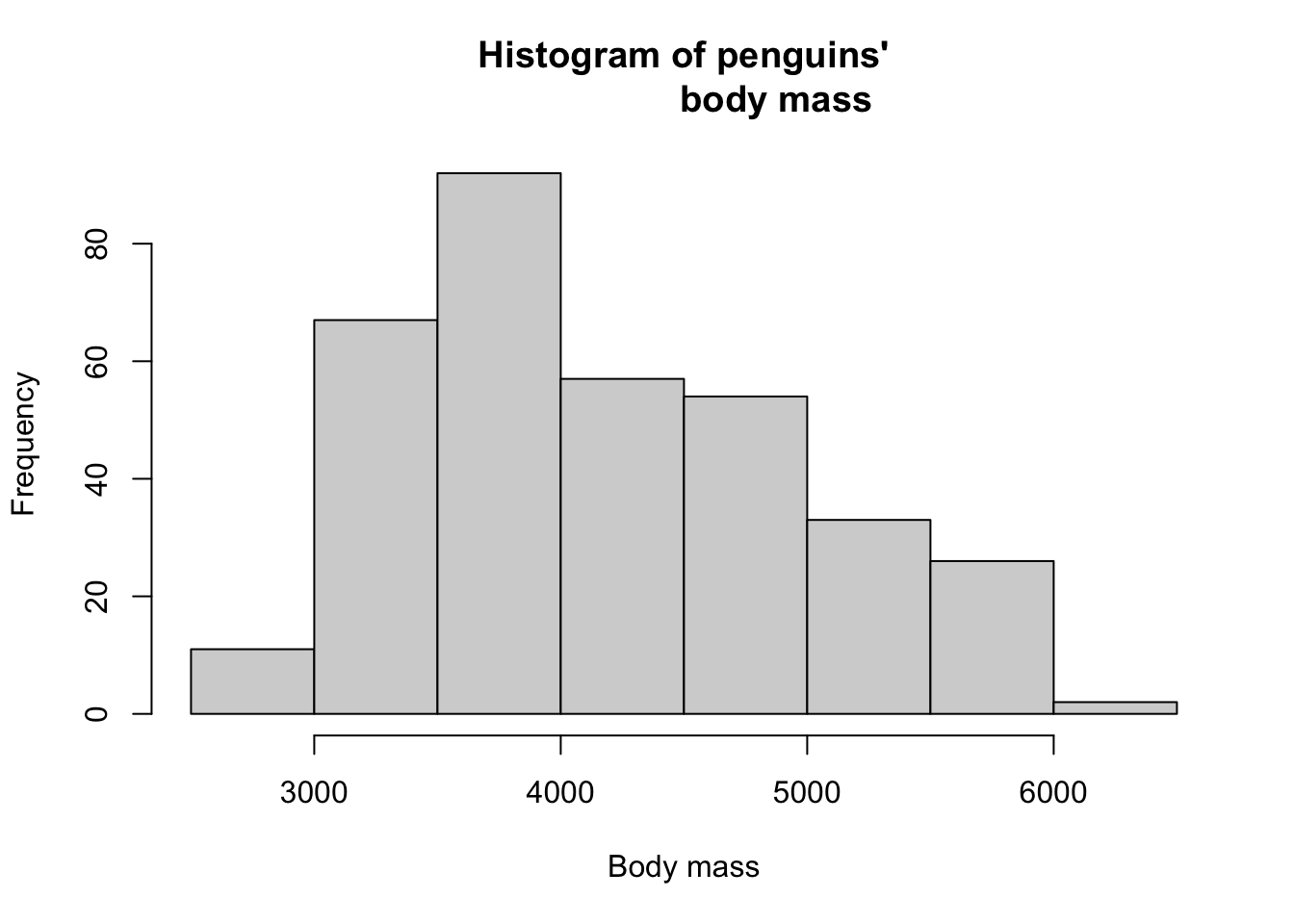
hist(
  x = penguins$body_mass_g,
  xlab = "Body mass",
  main = "Histogram of penguins'
                  body mass"
  )
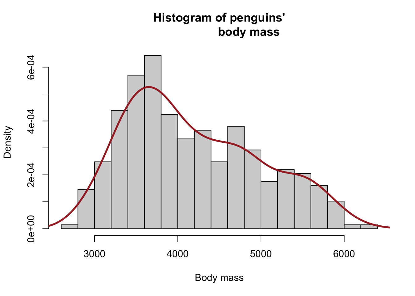
hist(
  x = penguins$body_mass_g,
  xlab = "Body mass",
  main = "Histogram of penguins'
                  body mass",
  breaks = 20,
  probability = T
  )
hist(
  x = penguins$body_mass_g,
  xlab = "Body mass",
  main = "Histogram of penguins'
                  body mass",
  breaks = 20,
  probability = T
  )
#
lines(
  density(x = penguins$body_mass_g,
          na.rm = T),
  lwd = 3, col = "brown"
  )
3.1 Exercise 3.1.1
(use mtcars data frame to answer the followings)
Create a histogram of
mpgwith appropriate labelsAdd density line to the plot obtained in Question 1.
4 Boxplot
-
Boxplot is a useful graphical tool that can be used to compare distribution of a quantitative variable at different levels of a qualitative variable
- E.g. examine the distribution of body mass over different species of penguins
-
boxplot()function can be used for both univariate and bivariate analysisboxplot(x)is used to obtain a boxplot of a single quantitative vectorxboxplot(formula, data)function is used for a bivariate analysis, where the formula species the quantitative and qualitative variables of interestformula = quant_var ~ qual_vardatais a data frame that must containquant_varandqual_var
boxplot(x = penguins$body_mass_g)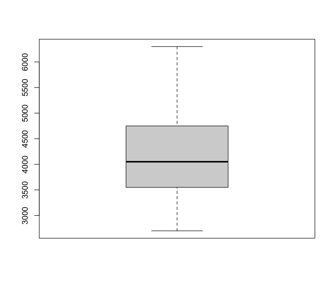
boxplot(formula = body_mass_g ~ species,
        data = penguins)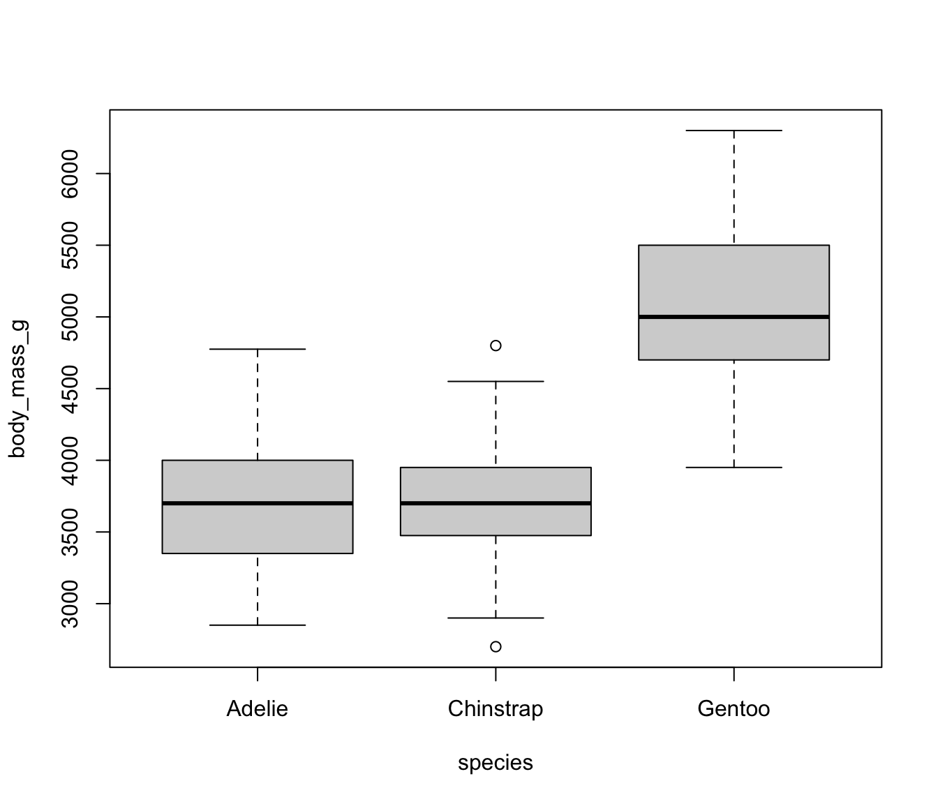
4.1 Exercise 3.1.2
(use mtcars data frame to answer the followings)
Create a boxplot of
qsecwith appropriate labels.Create a boxplot of
mpgto compare its distribution at different levels ofcyl
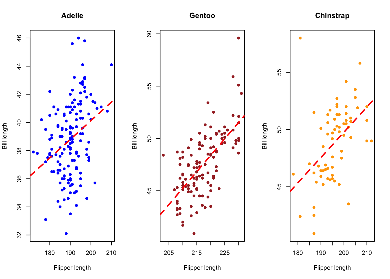
5 Scatter plot
The function
plot(x, y)is used to obtain a scatter plot of two quantitative variablesxandy-
Some useful arguments of
plot()functionxlab,ylab,mainpch(point type)cex(size of points), etc.
#
plot(x = penguins$bill_length_mm,
     y = penguins$flipper_length_mm)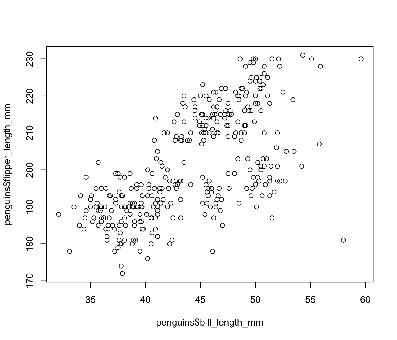
plot(x = penguins$bill_length_mm,
     y = penguins$flipper_length_mm,
xlab = "Flipper length") 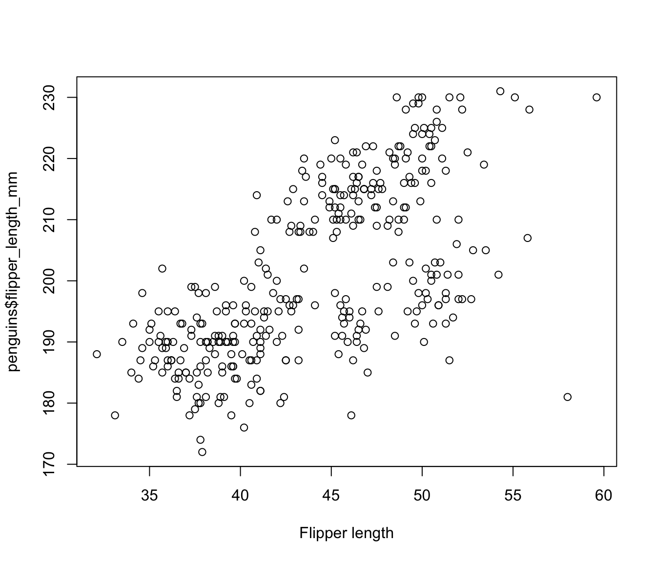
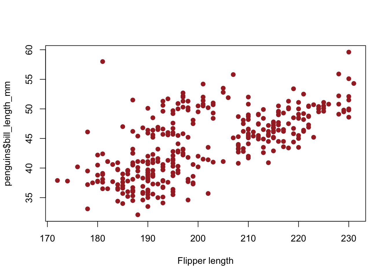
plot(
  x = penguins$flipper_length_mm,
  y = penguins$bill_length_mm,
  xlab = "Flipper length",
  pch = 20,
  cex = 1.5,
  col = "brown"
  )
5.1 Scatter plot with a linear model fit
plot(
  x = penguins$flipper_length_mm,
  y = penguins$bill_length_mm,
  xlab = "Flipper length",
  pch = 20,
  cex = 1.5,
  col = "brown")
#
mod1 <- lm(bill_length_mm ~ flipper_length_mm,
     data = penguins)
#
abline(mod1, col = "blue", lwd = 4)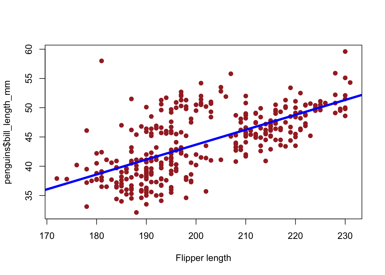
-
lm()is for fitting a linear model
5.2 Exercise 3.1.3
(use mtcars data frame to answer the followings)
Create a scatter plot to examine the association between
mpganddispAdd the fit of a linear regression model
mpgondispto the plot obtained in Question 6
6 Bar chart
Bar chart is used to examine the distribution of a qualitative variable
The function
barplot(height, ...)is used to obtain a bar chart in R, whereheightrepresents a frequencytable()function takes a qualitative variable as an argument and returnsheight, the frequency corresponding to each level of the qualitative variable
6.1 Frequency distribution of species
table(penguins$species)
#>
#>    Adelie Chinstrap    Gentoo
#>       152        68       124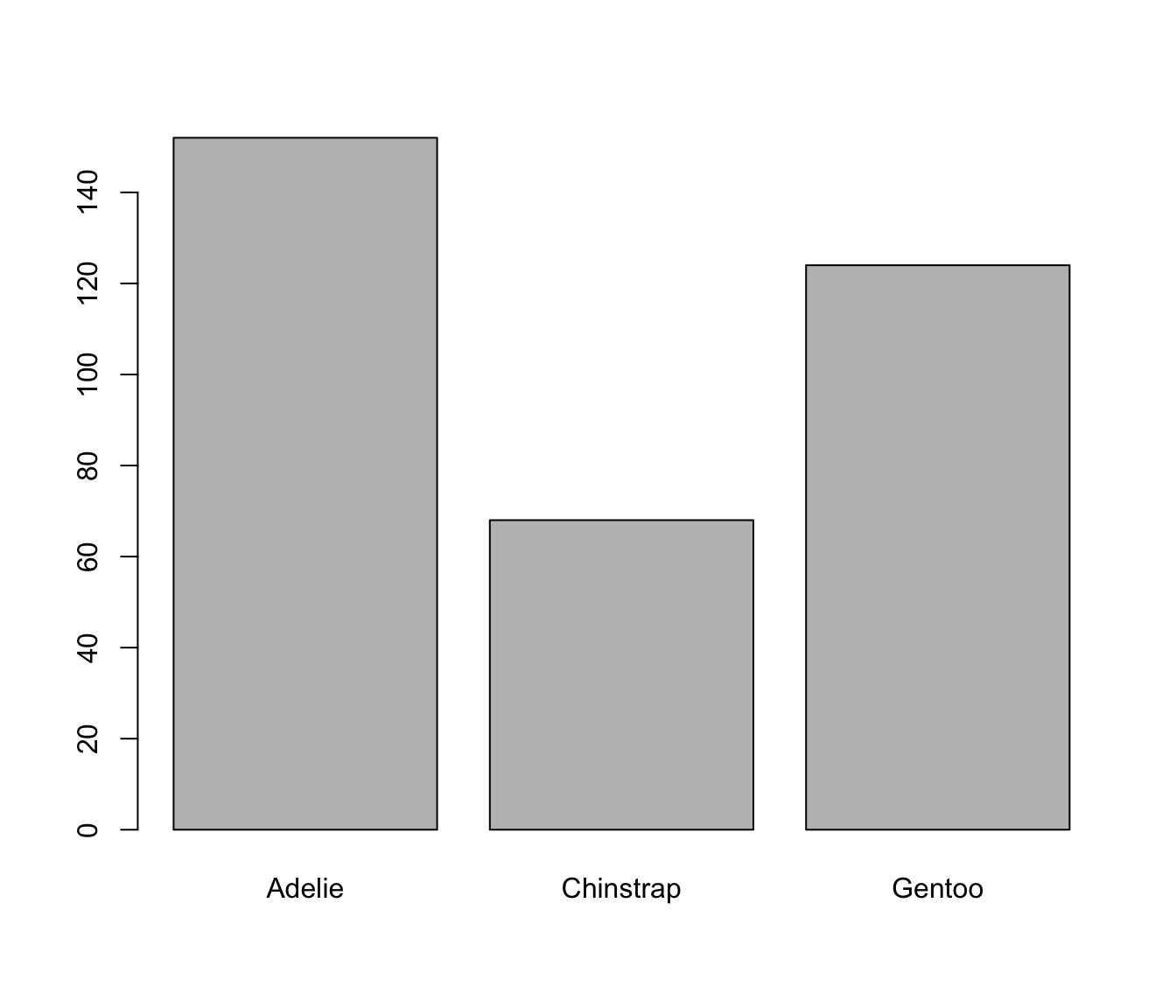
6.2 Exercise 3.1.4
(use mtcars data frame to answer the followings)
- Create a barchart if
cyl
6.3 Bivariate analysis
The function
par()has many arguments that can be used to produce high-quality graphs using base R plot functions-
mfrowargument ofpar()is used to split a figure layout into a number of rows and columns- E.g.
mfrow = c(2, 3)will split the figure layout into two rows and three columns
- E.g.
Distribution of bill_length_mm at different levels of species
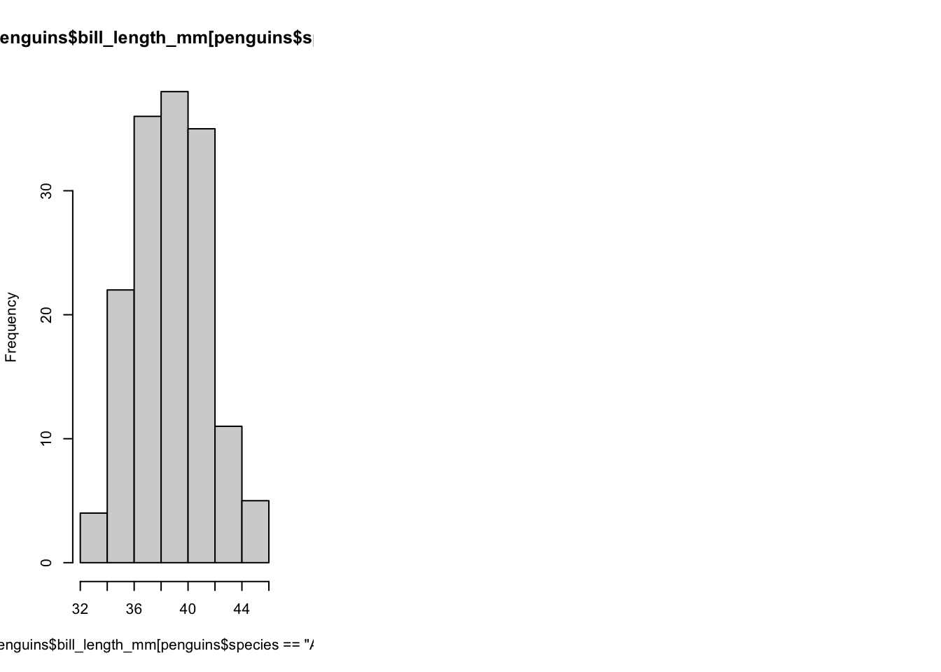
par(mfrow = c(1, 3))
hist(x = penguins$bill_length_mm[penguins$species == "Adelie"])
hist(x = penguins$bill_length_mm[penguins$species == "Gentoo"])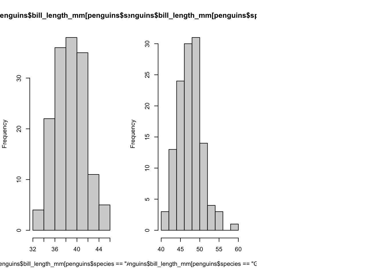
par(mfrow = c(1, 3))
hist(x = penguins$bill_length_mm[penguins$species == "Adelie"])
hist(x = penguins$bill_length_mm[penguins$species == "Gentoo"])
hist(x = penguins$bill_length_mm[penguins$species == "Chinstrap"])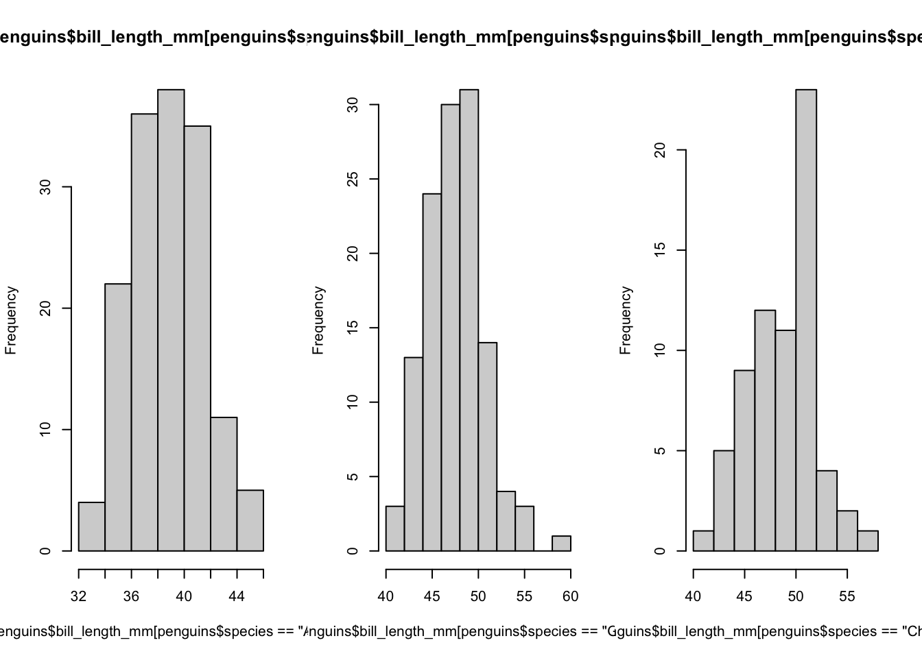
6.4 Exercise 3.1.5
- Association between bill and flipper lengths by species